Web Design for open doors

SiteMaps
This is a site map design for Open Doors Shelter in Norwalk, CT. Created to improve user navigation and accessibility for those seeking support and services.

Mood Board
Mood board created for Open Doors Shelter, inspired by the brand’s color palette to reflect warmth, trust, and support. Designed to set the tone for a welcoming and cohesive visual identity.

Wireframe mobil
Mobile wireframe design for Open Doors Shelter in Norwalk, CT . Built with accessibility and ease of use in mind, guiding users to vital resources quickly and intuitively.

Wire Frame for Open Doors
Simplified and redesigned site maps for Open Doors Shelter in Norwalk, CT — focusing on clean lines, clear structure, and intuitive navigation to enhance the user experience.
OPEN DOORS SOCIAL ADS

For this Instagram ad, I drew inspiration from the website design I previously created for Open Doors Shelter. Using Adobe XD, I designed the post to align visually with the brand, incorporating colors from the logo and a layout that reflects the organization’s tone of care and compassion. The target persona was an older woman in her 70s
For this Instagram ad, I drew inspiration from the website design I previously created for Open Doors Shelter. Using Adobe XD, I designed the post to align visually with the brand, incorporating colors from the logo and a layout that reflects the organization’s tone of care and compassion. The target persona was an older woman in her 70s looking for shelter services. With bold, clear headers and a warm visual style, the ad was created to be both eye-catching and emotionally resonant.businesses, and we're committed to helping our clients achieve their goals through our work.
This ad was designed to showcase Open Doors Shelter’s dedication to offering hygiene essentials without question. I used Photoshop to match the color scheme to the brand’s logo and designed a clean, approachable layout. Featuring a soap bottle with the shelter’s logo, the ad symbolizes care and support. I then brought the design into Adob
This ad was designed to showcase Open Doors Shelter’s dedication to offering hygiene essentials without question. I used Photoshop to match the color scheme to the brand’s logo and designed a clean, approachable layout. Featuring a soap bottle with the shelter’s logo, the ad symbolizes care and support. I then brought the design into Adobe XD to finalize the typography and ensure the message was clear, compassionate, and on-brand.
For this ad, I used the image of a warm, inviting door to symbolize safety and hope . Letting viewers know there’s always a place to turn. The headline focused on reassurance, reminding people they are not alone and that Open Doors Shelter offers a clean, judgment-free space. I used the brand’s signature orange and teal colors to keep the
For this ad, I used the image of a warm, inviting door to symbolize safety and hope . Letting viewers know there’s always a place to turn. The headline focused on reassurance, reminding people they are not alone and that Open Doors Shelter offers a clean, judgment-free space. I used the brand’s signature orange and teal colors to keep the design consistent and recognizable. The final layout was designed to be both emotionally impactful and visually cohesive, staying true to Open Doors' mission.

Our Approach
Our Experience
Open Doors Shelter’s banner ads, I used Adobe XD to create designs that visually align with their website, maintaining a consistent and recognizable brand identity. The layout was clean, easy to read, and focused on accessibility. Ensuring the message was clear while reinforcing the shelter’s supportive and welcoming tone.
Our Experience
Our Experience
Our Experience
Open Doors Shelter’s banner ads, I used Adobe XD to design a clean, easy-to-read layout that reflects the look and feel of their website. I created multiple versions of the ads, adjusting the color schemes within the brand palette and updating headers for each variation. This gave the organization flexible, on-brand options to test and us
Open Doors Shelter’s banner ads, I used Adobe XD to design a clean, easy-to-read layout that reflects the look and feel of their website. I created multiple versions of the ads, adjusting the color schemes within the brand palette and updating headers for each variation. This gave the organization flexible, on-brand options to test and use across different platforms while keeping the overall visual identity consistent.
Our Experience
Our Experience
Our Experience
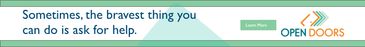
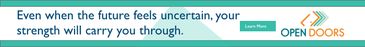
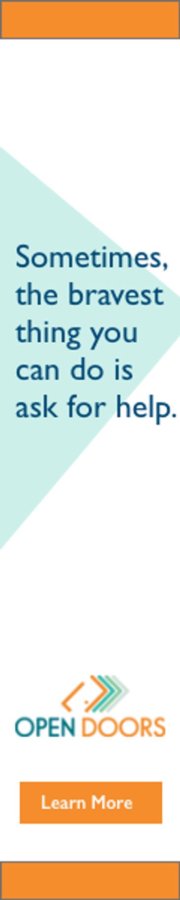
For Open Doors Shelter’s banner ad campaign, I used Adobe XD to design a series of clean, accessible ads that align with the organization’s website and branding. Each banner featured inspiring headers tailored to connect with viewers emotionally, along with a 'Learn More' button linking directly to the Open Doors website for additional re
For Open Doors Shelter’s banner ad campaign, I used Adobe XD to design a series of clean, accessible ads that align with the organization’s website and branding. Each banner featured inspiring headers tailored to connect with viewers emotionally, along with a 'Learn More' button linking directly to the Open Doors website for additional resources. I created multiple versions by varying the colors within the brand palette and adjusting headlines, giving the team flexible, on-brand options to test across platforms while maintaining a consistent and welcoming tone.